
Creating a good, usable logo with an AI logo maker is easy.
Creating a logo that can capture your brand identity is harder.
Think about restaurants. A fine dining restaurant vs a local family diner are in the same food industry, but they have wildly different branding and will thus need different logos.
Industry is just one aspect. Your target audience, your position in the market, as well as the personality you want to convey will be a huge factor in how your logo should look.
Which is exactly what we wanted to test with four popular AI logo makers: Design.com, Looka, Canva, and Adobe Express. Can these tools properly capture the nuance of creating a brand identity? Can they give a distinct logo that conveys your identity and overall vibe, and not just default to giving you generic icons that are associated with your industry?
Let's see how these tools match up to each other.
Design.com vs Looka vs Adobe Express vs Canva: Quick Summary
| Category | Design.com (Sponsored) | Looka | Adobe Express | Canva |
|---|---|---|---|---|
| Brief accuracy | Strong; brought the full brief together | Limited by guided selections | Needs refinement on prompts just to get the right result | Fine, got some of the parts right while some can be better |
| Brand personality | Strong; translated "friendly and upbeat" into visual choices | Weak; logos didn't feel particularly friendly or colorful | Good; bright and playful, but could use more personality | Good but fairly straightforward |
| Creative variety | High; explored different styles, mascots, typography, and compositions | Limited; often reused selected symbols in different layouts | Moderate; different designs, but similar art direction | Moderate; relevant concepts, but some felt basic |
| Logo quality | Polished and ready for use from the get go | Clean and usable | Visually appealing at first glance, but inconsistent upon closer inspection | Good and usable |
| AI artifacts | None | None | Frequent; including text and graphic errors | Some issues on text, otherwise no other issue |
| User direction needed | Minimal | High; user makes many visual choices upfront | Minimal | High; needed more specific prompting |
| Editing required | Little to none | Moderate; more creative direction needed from the user | Moderate; customization can make concepts more distinctive | High; prompt refinement and cleanup needed |
From our testing, we found that Design.com is the overall best AI logo generator for creating logos that can show your brand identity.
Featured Sponsor
How We Tested the AI Logo Makers
For the test, we had the prompt "Create a logo for Yummy Dumplings, a friendly and upbeat dumpling restaurant".
The prompt was incredibly simple for many purposes.
First is that we are looking at this through a beginner's lens, like what a small business owner who doesn't know how to design or make the most technical prompt would type in.
Second is that we wanted to leave some creative decisions to the AI and see what typography or art style it would pick. That's why we didn't specifically request to add a mascot, to pick a particular color palette, etc.
Last and most importantly, we wanted to see if these tools could (like a human designer would) consider your overall brand identity to create a suitable logo, or if it would just meet one keyword and call it a day.
So a great Yummy Dumpling's logo should ideally have:
- Dumpling icons
- Bright and colorful palette
- Bolder fonts
- Asian-inspired
- Friendly and upbeat elements, whether through the art style, illustrations, font choices, usage of mascots, etc.
We would then look at four areas: brief accuracy, brand personality and creativity, overall logo quality, and how much editing would be needed to get the result ready to use.
These should help us see how Design.com vs Looka vs Adobe Express vs Canva would compare to each other, as well as see if they are suitable to be recommended as one of the best logo design tools for startups and creators.
For a wider ranking of five logo tools tested with a single brief, see our best logo design software 2026 roundup.
Design.com vs Looka vs Adobe Express vs Canva: Which AI Understood the Whole Request?
First is the most straightforward question: did the logos actually match what we asked for?
And no, it's not just whether the logo has a dumpling or not. We wanted to see whether it could bring together the food, cultural influence, and personality into one design.
Design.com (Sponsored)
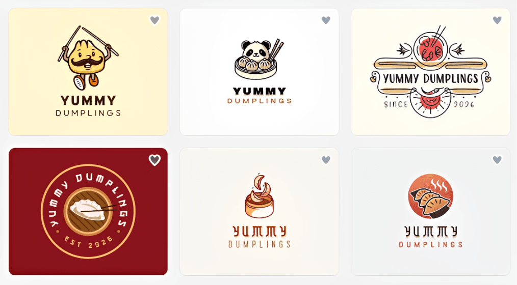
Design.com did the best job of looking at the brief as a whole.
The results clearly looked like they belonged to a dumpling restaurant, with dumplings and other relevant imagery appearing throughout. There were also clear Chinese-inspired elements, which made sense for the business.
But the biggest difference was how it handled "friendly and upbeat."
Rather than treating that as another keyword to check off (like adding a random smiley face icon somewhere), many of the designs incorporated it naturally into the logo. We saw laughing dumplings, mascot-like characters, vibrant colors, playful graphics, and bigger, bolder typography.
The result was a collection of logos that looked like they belonged specifically to Yummy Dumplings, not just to any other Chinese restaurant.
Design.com's approach helps here: AI uses information from your prompt, including your business name, industry, and keywords, to generate relevant logos and surface designs from its large design library. That, combined with its huge library of templates and visual elements, gives it more ways to creatively interpret the brief while also having enough relevant ingredients to build the right logo concept.
Looka
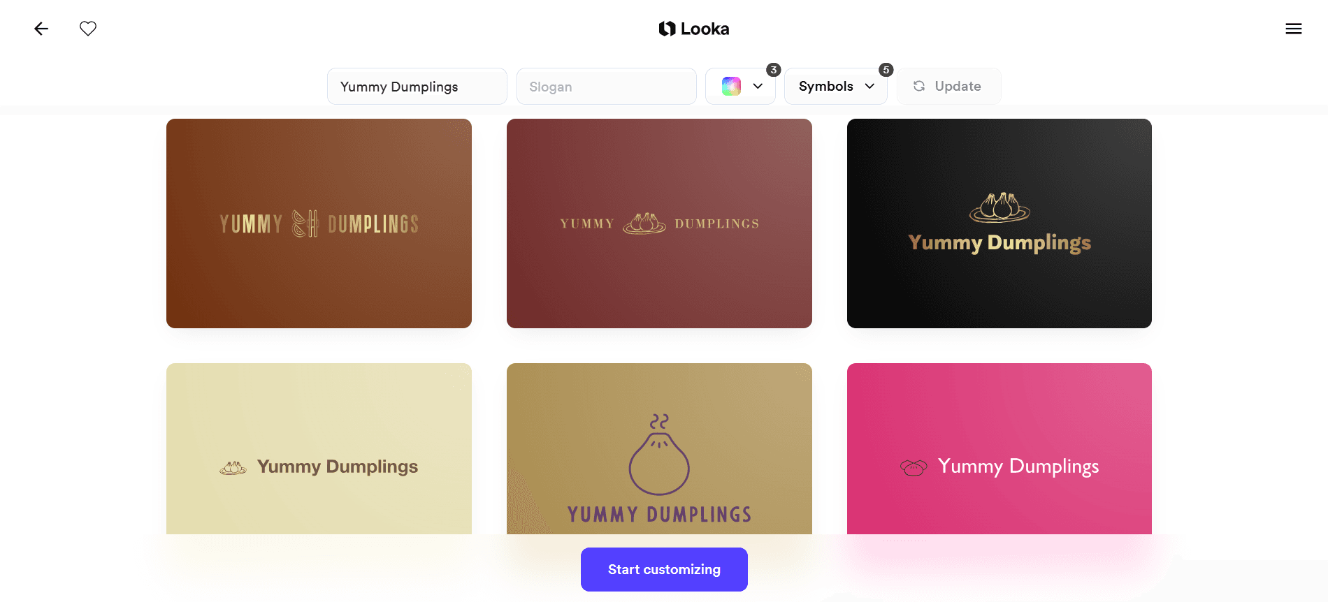
Looka works differently because you don't start with a prompt. Instead, answer a questionnaire and choose from photos to select styles, colors, or symbols that appeal to you. Looka then uses those preferences to generate designs.
This approach is easy to follow particularly if you're a visual person. The problem for this particular test was nuance.
Based on our answers, we could only choose categories like "Food" or "Restaurant" to pick the symbols we could see on the logo. However, it's not as specific as say a dumpling restaurant or even a Chinese restaurant, which means a lot of irrelevant results after.
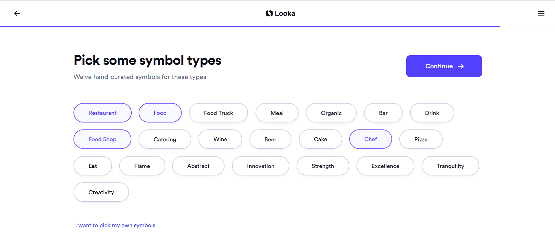
But if we pick symbols ourselves, we would be limited to only seeing the specific symbols we chose in the designs.
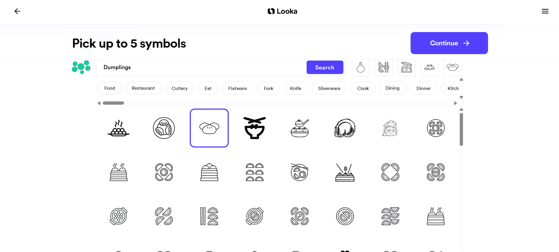
That's not necessarily a problem if you already know what you want. If you've decided on your symbol, colors, and general style, Looka gives you a simple way to put those ingredients together. But it asks the user to make more of the creative decisions upfront, plus leaves you very little room to add nuance to your design.
Adobe Express
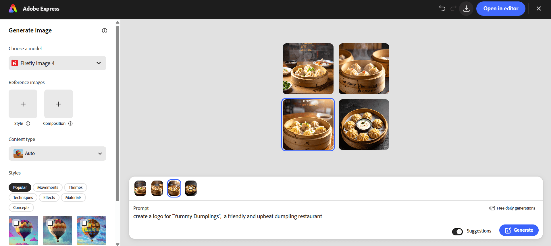
Adobe Express understood the subject of the brief, but we ran into a different problem: getting the AI to produce an actual logo and not an image or graphic.
Our first results were bright, colorful, and appetizing, but they are more fit to be images on menus or posters than logos.
We eventually added more restrictions to our prompt such as "centered, isolated on a plain background, square composition." That produced results that looked much more like actual logo concepts.
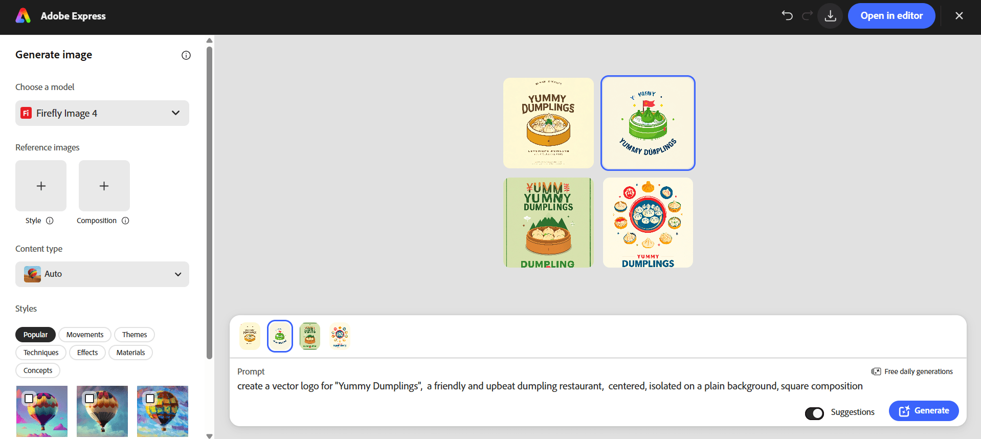
Adobe itself recommends adding more descriptive words for better results and allows users to provide style and composition references when they want greater control over the output.
Sure that flexibility is useful, but it also assumes that you know what instructions to give. Someone using an AI logo maker for the first time may just think that they want a "friendly dumpling logo," but not necessarily that they need to specify the composition and background to prevent the AI from creating something closer to a poster.
Canva
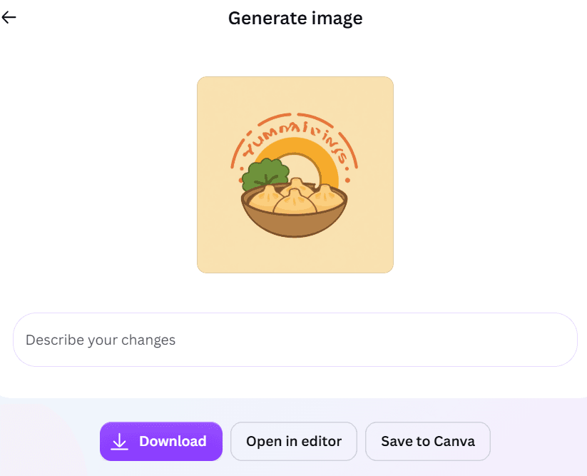
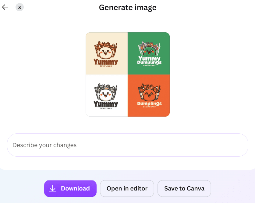
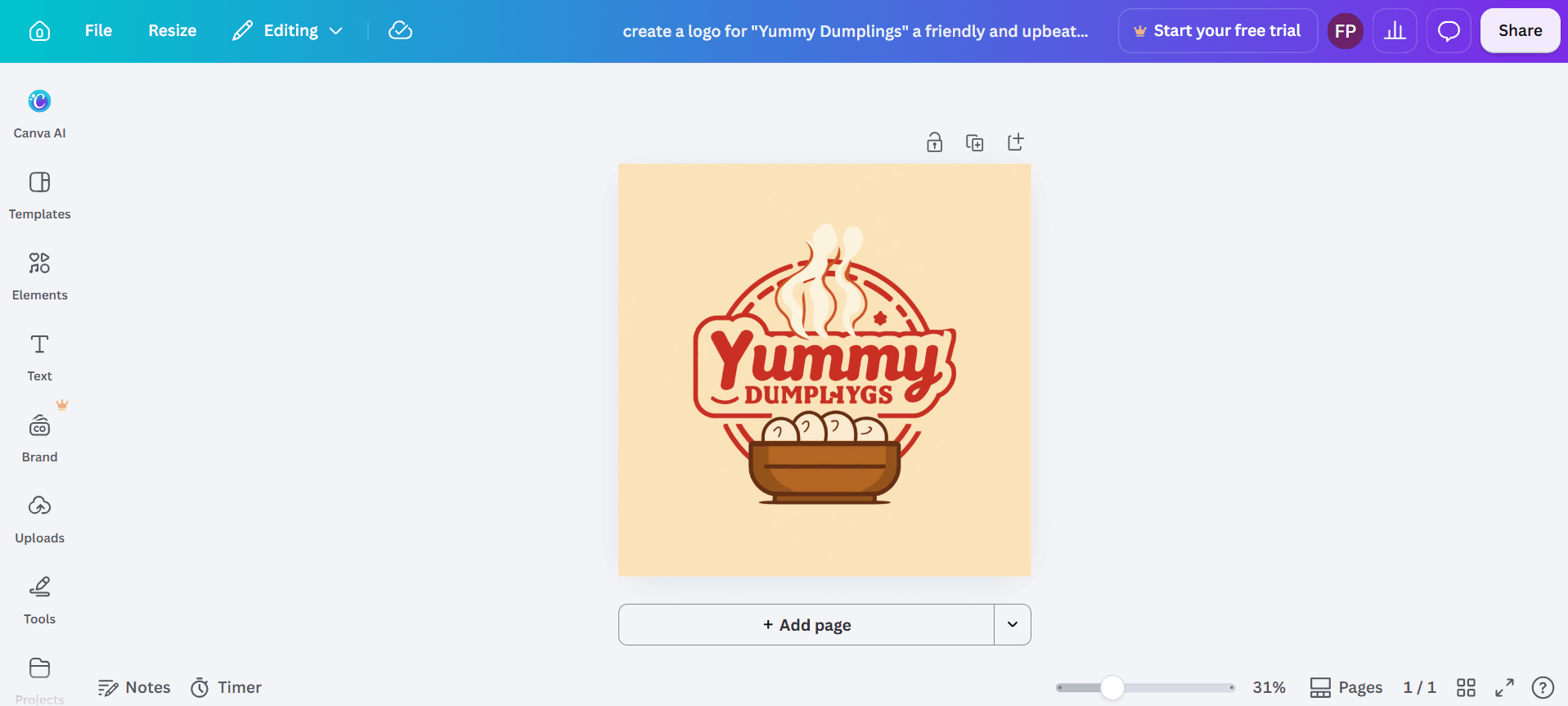
Canva did a good job with the straightforward parts of the brief.
The results incorporated dumplings, had a recognizable Asian influence, and generally used the brighter colors we wanted. Canva's AI logo generator also accepts natural-language prompts and lets you "edit" by regenerating, so it's fairly easy to change the color or add a mascot if necessary.
Where it fell slightly short was the personality. The results met the requirements, but they didn't always do much beyond them. We got bright, relevant dumpling logos, but fewer designs that gave Yummy Dumplings a particularly memorable character.
Design.com vs Looka vs Adobe Express vs Canva: Which Created the Right Brand Identity?
This was where the differences became much clearer.
All four platforms could understand food-related imagery. But "friendly" isn't an object you can simply insert into a logo. The tool has to translate that word into actual design decisions.
Design.com (Sponsored)
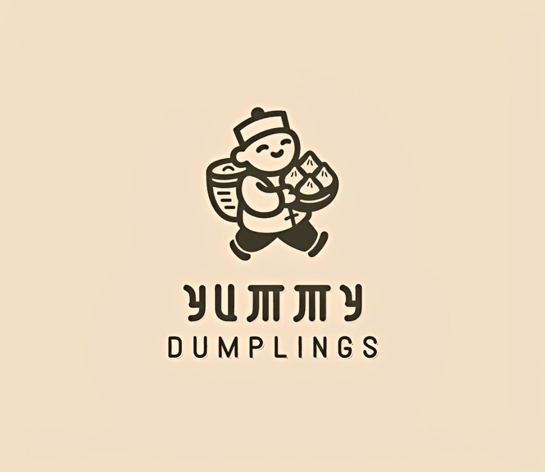
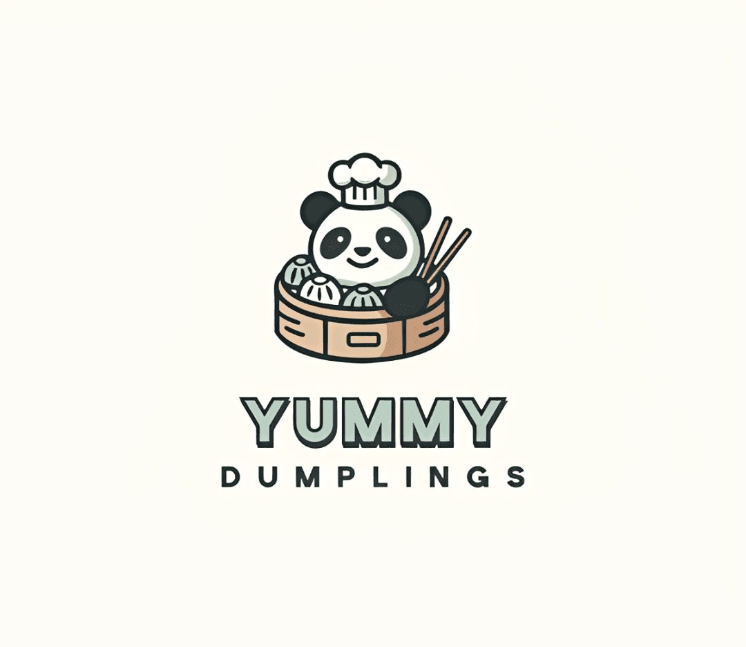
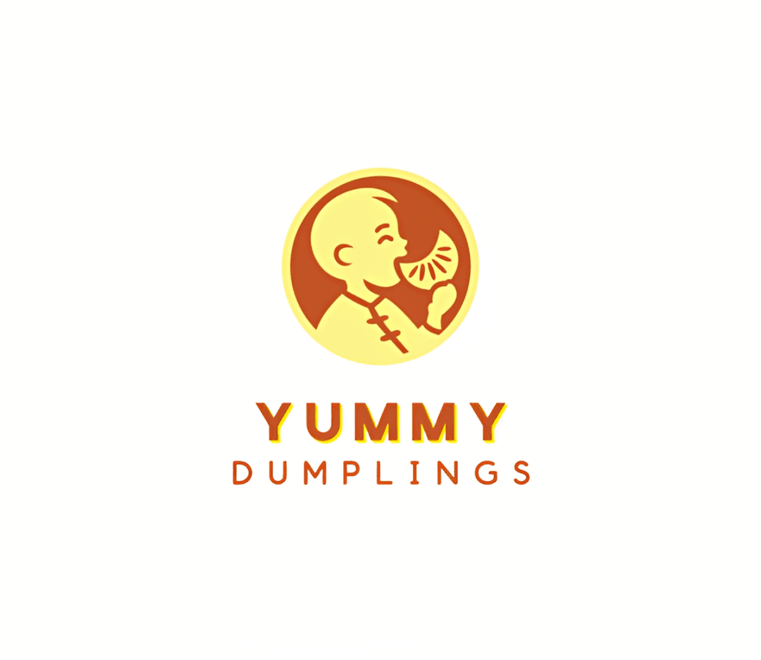
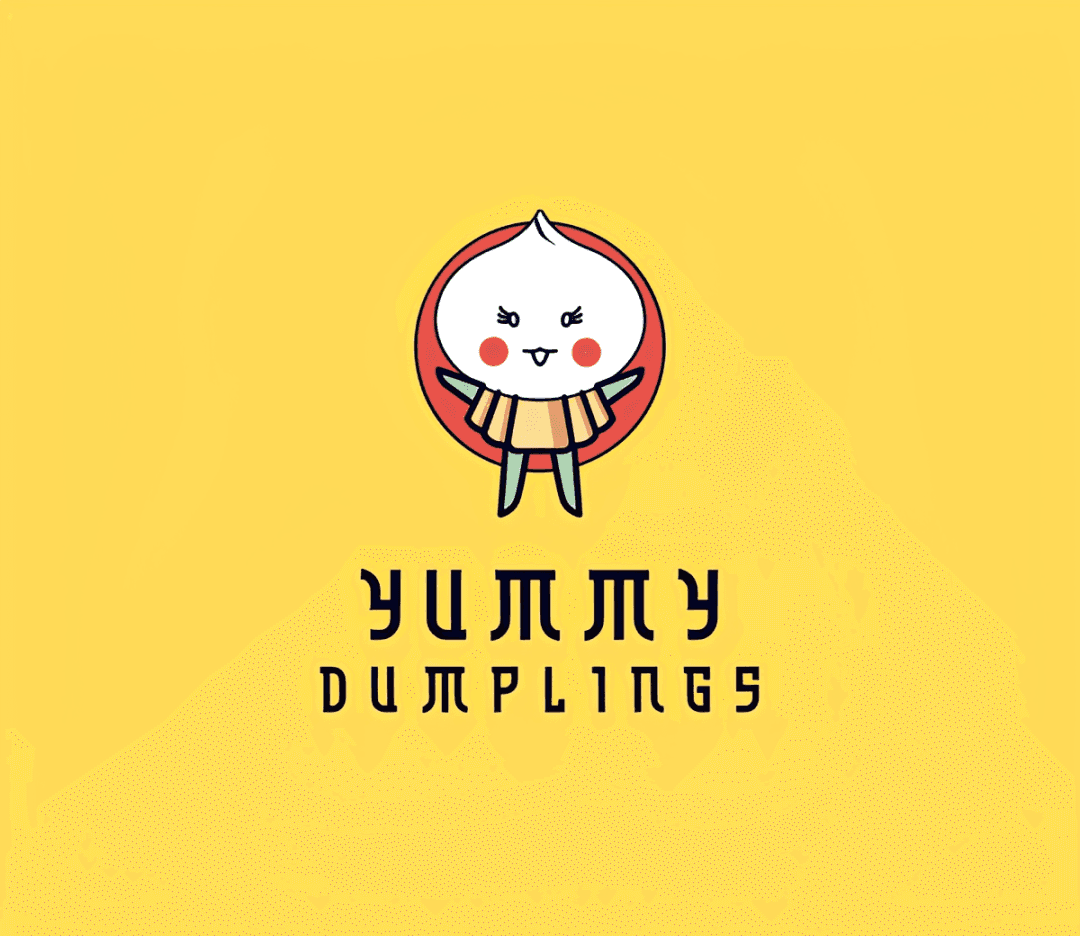
Design.com had the strongest interpretation of the brand personality.
A particularly good example was its use of mascots. Some concepts turned the dumpling itself into a character by adding a smiling face or giving it a more expressive pose.
Other designs communicated the same personality differently by using bold lettering or brighter color combinations.
This is the nuance of brand identity that we were hoping to see from the test. We asked for a friendly brand, and the tool decided that it can be communicated through different visual elements.
There was also good variety between the concepts. We weren't simply seeing one mascot moved around or recolored (unlike in Looka, more of that later). Some designs leaned more heavily into illustration, while others relied more on typography, symbols, or simpler compositions.
Looka
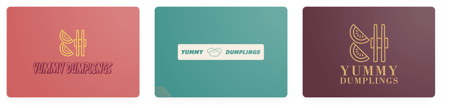
Looka struggled more with the personality side of the brief. None of the logos we saw felt particularly friendly or upbeat.
While some did use bright yellows or reds, which technically fit the colorful direction we wanted, it wasn't enough to communicate the personality of Yummy Dumplings. We also didn't see the same playful characters, expressive graphics, or other details that made the brand feel noticeably friendly.
Part of the problem is how much Looka narrows down the results based on their settings. If you chose a logo style or symbol, you're pretty much locked in to that. That makes it easy to explore variations of a direction you already like, but there's less nuance in how Looka interprets the brand itself.
At the same time, we found their library a little lacking. Some keywords have around 20 to 50 options max. While they have some variety, it's not a lot. This means your "ingredients" to building the logo are already lacking, and it will be even more obvious on more nuanced requests like this.
Most of the results are also the same logo, just in different colorways.
Adobe Express
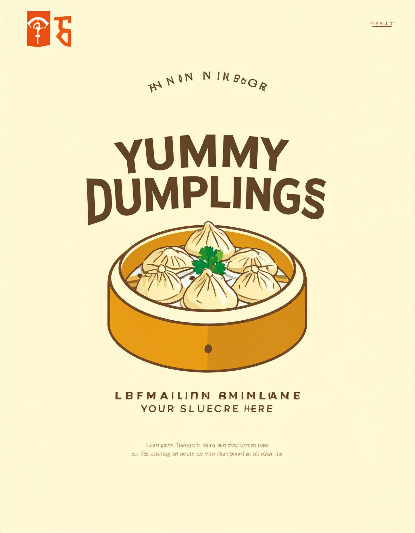
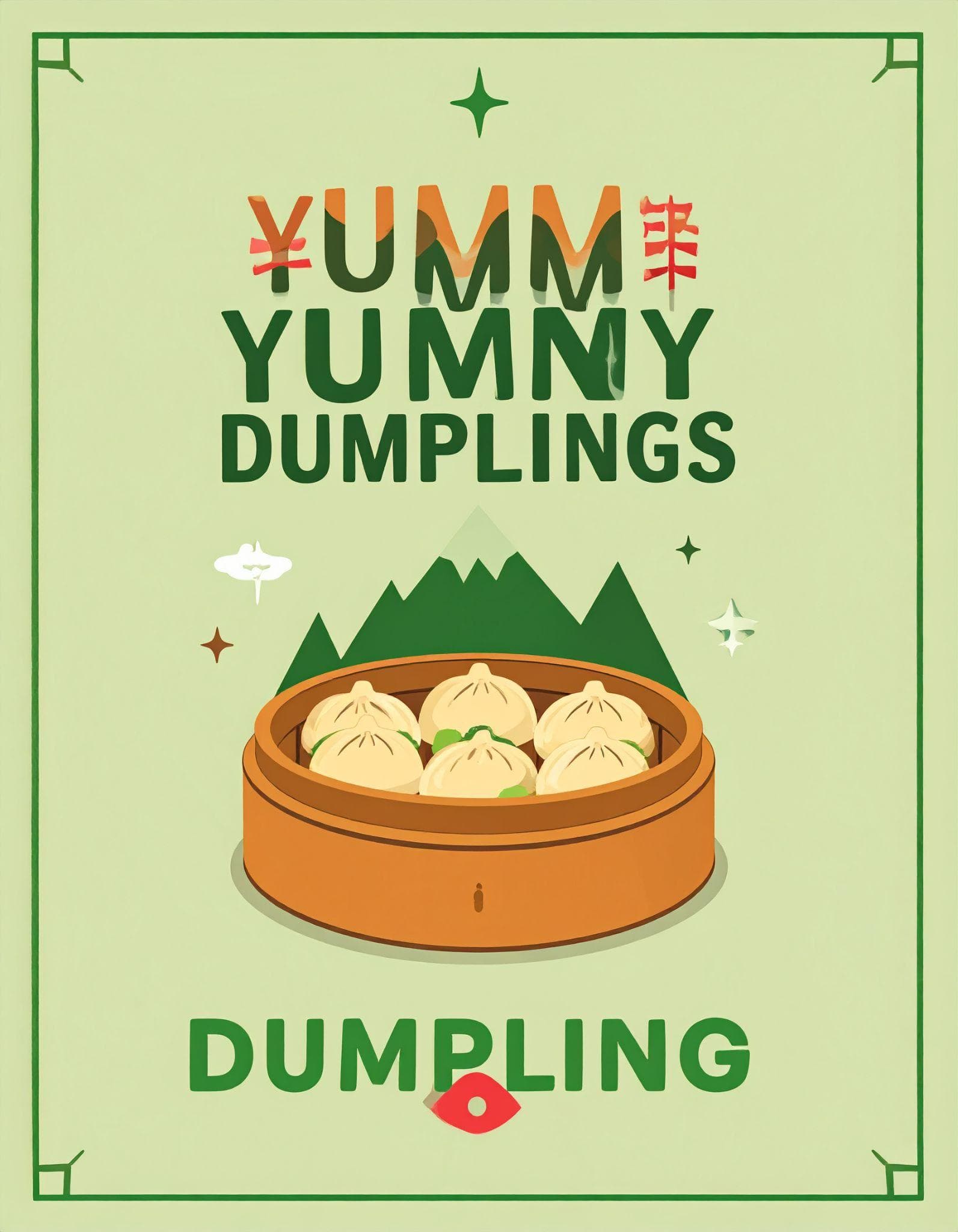
Adobe Express did a good job of capturing the brighter, more upbeat side of the brief. The logos used pastel but still colorful palettes, lively typography, and playful art styles, so they didn't feel overly serious or corporate.
However, we wanted to see a little more personality in the concepts themselves. There weren't many mascots or character-driven designs, for example. While we are not requiring the tools to create a smiling dumpling just to call it friendly, adding more expressive illustrations or details could have made some of the concepts feel more distinctly like Yummy Dumplings, rather than simply another fun dumpling restaurant.
We also wanted more variety between the different logo styles. While the individual results looked different at first glance, you'll notice that they stayed in the same direction. It would have been interesting to see Adobe Express interpret the same personality through a wider range of approaches, such as a mascot logo, a simpler wordmark, a bold emblem, or a more graphic symbol.
Overall, Adobe Express understood the general mood we were going for. We just wanted it to explore more ways of expressing that personality, rather than relying mainly on color, typography, and a similar illustration style to make the logos feel upbeat.
Canva
Canva sat somewhere in the middle.
Its results were bright and approachable, so it certainly didn't miss the personality completely. The logos generally made sense for a casual, upbeat dumpling restaurant.
The concepts were just a little safer.
A lot of the identity came from obvious choices such as colorful palettes and dumpling imagery. They worked, but they didn't always have the extra character we saw in Design.com's mascot-style or more detailed concepts.
That isn't necessarily bad. If you want a straightforward logo and plan to customize it yourself afterward, Canva gives you a solid starting point.
Design.com vs Looka vs Adobe Express vs Canva: Which Has the Best Logo Quality?
A great concept doesn't help much if the finished graphic has obvious errors.
This became another major dividing line between the four platforms.
Design.com (Sponsored)
Design.com's results were consistently polished.
Typography was properly rendered, graphics looked intentional, colors stayed clean, and we didn't notice the typical AI-generation errors such as misspelled business names, smeared lettering, or malformed graphics.
That was particularly useful for the more detailed mascot designs. Adding faces and other small details gives generative AI more opportunities to get something wrong, but the logos we tested remained clean.
The designs also still looked like logos. Even the more elaborate options had a clear composition that could realistically work as a business identity.
Looka
Looka also performed well from a technical standpoint.
The logos were clean, readable, and usable. Its biggest weakness wasn't broken graphics or strange AI artifacts; it was that the results could feel basic or constrained by the choices we'd already made. You may simply need to spend longer finding or creating a direction that feels distinctive enough for your business.
Adobe Express
Adobe Express had the biggest quality problems in our test. First is that they can't produce a logo without putting more constraints. And even the new prompt still gave us something that could still be better used as a social media post.
Then the actual logos itself. We saw misspellings, smeared text, partially colored icons, and other small generation errors. Some concepts looked promising at first glance, only for those problems to become obvious when we looked closer.
That creates extra work.
You may like the overall composition and personality, but if the restaurant name is malformed or part of the illustration hasn't been rendered correctly, the logo isn't ready to use.
Adobe Express does provide editing tools after generation, and its newer AI Assistant can make page-wide or targeted edits through conversational instructions, although Adobe notes that the beta feature is still rolling out and availability can vary by account.
Still, we'd rather start with a clean logo than need those tools to repair generation mistakes.
Canva
Canva's logos were good and usable.
The graphics generally looked clean, and the concepts were recognizable as logos. While some have minor issues with text, it's nothing that's not fixable. Again, our main issue wasn't technical quality but simplicity.
For a small business that wants a bright dumpling logo without doing much experimentation, that might be perfectly adequate. But if you're hoping the AI will come up with a more distinctive visual identity for you, some of the results may need further customization.
Design.com vs Looka vs Adobe Express vs Canva: Which One Got Closest on the First Try?
AI logo makers are often aimed at people who don't have professional design experience. A small-business owner probably doesn't want to spend an hour rebuilding the logo after generating it.
Ideally, the tool itself should do most of the heavy lifting. So how do these four compare?
Design.com (Sponsored)
Design.com required the least editing in our test because there was simply less that needed correcting.
Their designs already combined the right industry, cultural influence, colors, and personality. They were also technically clean of AI artifacts.
That means most changes would be about preference rather than fixing mistakes. You might decide you'd rather have blue instead of orange or prefer another font, but you wouldn't necessarily need to rethink the entire concept. It's definitely the most convenient and hassle-free option between these four.
Looka
Looka requires more work before generation than the editing afterward.
You're choosing styles, colors, symbols, and other preferences upfront, so you're effectively helping establish the identity yourself.
For some users, that's actually an advantage. If you already know you want a red dumpling icon paired with a particular visual style, Looka gives you an easy way to explore versions of that idea.
However, for a test that's focused on getting the nuances of your brand identity right, Looka failed in that regard.
Adobe Express
Adobe Express required the most intervention.
First, we needed to improve the prompt to get consistently logo-like compositions. Then we'd still need to address the generation artifacts that appeared in several results.
Someone familiar with prompting might immediately know to specify things such as a plain background, centered composition, isolated logo mark, or simpler graphics. A beginner may not.
For a tool that's supposed to make logo creation easier, needing to know those tricks adds an extra hurdle.
Canva
Canva's initial concepts were usable, but we'd be more likely to edit them if we wanted Yummy Dumplings to feel particularly distinctive or unique.
The fundamentals were there. The work would mostly involve taking a decent concept and giving it more personality through different typography, colors, graphics, or layout choices.
For users already comfortable with Canva, that's unlikely to be a major obstacle. You can access their manual editor, have the AI regenerate, or even do AI chat editing inside. But if you are looking at just the first result, Canva is fine but not stellar.
Pros and Cons of Each AI Logo Maker
Design.com (Sponsored)
- Brought the full brief together: dumplings, Asian influence, bright colors, and a friendly personality
- Translated 'friendly and upbeat' into mascots, playful graphics, and bold typography without being told to
- High creative variety across illustration, typography, symbol, and simpler compositions
- Polished logos with no misspellings, smeared lettering, or malformed graphics
- Least editing needed, so changes are about preference rather than fixing mistakes
- Prioritizes simplicity, so trained designers may want more granular controls
- The lowest prices require annual billing
Looka
- Guided questionnaire is easy to follow, especially for visual people
- Clean, readable, and usable logos with no AI artifacts
- Easy to explore variations if you already know your symbol, colors, and style
- Symbol categories like 'Food' or 'Restaurant' are too broad for a dumpling restaurant
- Choosing symbols locks you into those symbols across every result
- Some keywords have only around 20 to 50 options
- Logos didn't feel friendly or upbeat, and many were the same logo in different colorways
Adobe Express
- Captured the bright, colorful, upbeat direction with lively typography
- Style and composition references give more control over the output
- Editing tools and a newer AI Assistant (beta) are available after generation
- The first prompt produced food images rather than logos
- Needed prompt tricks like 'centered, isolated on a plain background, square composition'
- Frequent misspellings, smeared text, and partially colored icons
- Concepts stayed in a similar art direction with few mascots or character designs
Canva
- Got the straightforward parts right: dumplings, Asian influence, and bright colors
- Accepts natural-language prompts and lets you edit by regenerating
- Good and usable logos, with a manual editor and AI chat editing for refinement
- Concepts felt safer and fairly basic, with less memorable character
- Some text issues, including misspelled business names
- Needed more specific prompting and cleanup to feel distinctive
Why Is Brand Identity Important for a Logo?
This test highlights something that's easy to overlook when comparing AI logo makers: being relevant to an industry isn't the same thing as being relevant to a brand identity.
There could be many dumpling restaurants aside from Yummy Dumplings. One may want to look elegant and premium, one may want to focus on traditional cooking methods, one may want to specifically sell seafood dumplings, and so on.
While all of them sell dumplings, they all have different audiences and selling points. Using the same logo for all of them would just look completely wrong.
That's why your brand identity matters, and why it's important for an AI logo generator to understand that. It needs to know not only what your company does, but also what you want people to feel when they see it.
This also has a practical effect on the design process. The closer the first concepts are to the complete brief, the less time you have to spend changing fonts, replacing icons, adjusting colors, regenerating images, or trying to push the AI in a completely different direction.
Final Verdict: Which AI Logo Maker Created the Best Brand Identity?
All four tools could create something recognizable as a Yummy Dumplings logo, but they differed in how much of the brand behind the business they actually captured.
Looka produced clean logos, but its guided selections made it harder to communicate a more nuanced personality. Canva understood the main requirements and gave us solid, usable concepts, though some felt fairly basic. Adobe Express captured the bright and colorful direction well, but the generation errors also meant more cleanup afterward.
Design.com stood out because it did the best job of bringing the entire brief together.
It didn't just recognize that Yummy Dumplings was a dumpling restaurant. The results also reflected the Asian influence, bright visual direction, and, importantly, the friendly and upbeat personality we asked for.
What made that especially noticeable was how Design.com interpreted those less tangible parts of the brief. We never told it to create smiling dumplings, mascots, playful illustrations, or bold rounded typography. Those were design decisions it made to communicate the personality itself. And it didn't rely on just one approach: we saw different styles, compositions, characters, and treatments that still felt appropriate for the same business.
That gave us more genuinely different directions to choose from, rather than variations of essentially the same idea. The logos were also polished and free of the obvious AI artifacts we encountered elsewhere, so there was less to fix once we found a concept we liked.
For this test, that's ultimately what made Design.com the strongest choice. It came closest to turning a short description of a business into a complete visual identity, rather than simply turning individual keywords into a logo.
Want to see what Design.com does after the logo? Our Design.com review 2026 follows a full coffee-brand build from logo to business cards, social posts, and websites, and our best AI presentation tools 2026 roundup covers turning that brand into on-brand decks.
What the Community Is Saying
Public reviews add a second opinion beyond our single-brief test. Figures below are from Trustpilot as of October 2026.
Design.com (Sponsored) holds a 4.7 out of 5 TrustScore on Trustpilot, from more than 4,500 reviews. Reviewers most often praise how fast and simple it is, the wide range of professional design options, and prompt support. A recurring minority report unexpected subscription charges, so check renewal terms before you buy.
Looka holds a 4.4 out of 5 TrustScore on Trustpilot, from more than 14,000 reviews. Reviewers like its ease of use, clean modern designs, and fast, friendly support. Complaints focus on account access, billing and refund disputes, and a clunky mobile editing experience.
Canva holds a 4.0 out of 5 TrustScore on Trustpilot, from more than 7,600 reviews. Users call it easy and fun with a capable free plan, while common complaints are features locked behind Canva Pro, slow support, and billing frustrations.
Adobe holds a 1.1 out of 5 TrustScore on Trustpilot, from more than 7,500 reviews. That page covers Adobe as a whole rather than Adobe Express specifically, and most complaints center on subscription billing, cancellation fees, and support rather than design quality.
Bottom Line
Design.com (Sponsored) is the best pick in this comparison if you want an AI logo that captures your whole brand identity from a simple prompt: it combined the industry, cultural influence, and friendly personality of Yummy Dumplings into polished, artifact-free logos that needed little to no editing. Choose Looka if you already know your symbol, colors, and style and just want a guided way to assemble them. Choose Canva if you already design in Canva and are happy to refine a solid but basic starting point yourself. Choose Adobe Express only if you are comfortable writing detailed prompts and fixing generation errors, since it needed the most intervention of the four.
FAQ: Design.com vs Looka vs Adobe Express vs Canva
Which AI logo maker is best for creating a brand identity?
Design.com (Sponsored) performed best in our test. Given "Create a logo for Yummy Dumplings, a friendly and upbeat dumpling restaurant," it brought together dumplings, Asian-inspired elements, bright colors, and a friendly personality through mascots, playful graphics, and bold typography.
Is Design.com better than Looka?
For capturing brand personality, yes in our test. Looka produced clean, usable logos, but its guided symbol selections were too broad for a dumpling restaurant, and many results were the same logo in different colorways. Looka suits users who already know exactly which symbol and style they want.
Is Adobe Express good for making logos?
It captured the bright, upbeat mood well, but it was the weakest for logo quality in our test. The first prompt produced food images rather than logos, and even after adding "centered, isolated on a plain background, square composition," results had misspellings, smeared text, and partially colored icons.
Is Canva's AI logo generator good?
Canva's logos were good and usable, with dumplings, Asian influence, and bright colors, but the concepts felt safer and fairly basic. Some had minor text issues. It is a solid starting point if you plan to customize the logo yourself in Canva's editor.
Which AI logo maker needs the least editing?
Design.com required the least editing in our test, because its designs already combined the right industry, cultural influence, colors, and personality and were free of AI artifacts. Changes would be about preference, like a different color or font, rather than fixing mistakes.
Do AI logo makers make spelling mistakes?
Some do. In our test, Adobe Express frequently misspelled or smeared the business name, and Canva had some text issues. Design.com and Looka produced no AI artifacts such as misspelled names or malformed graphics.
Why does brand identity matter for a logo?
Being relevant to an industry isn't the same as being relevant to a brand. Two dumpling restaurants can target different audiences, one elegant and premium, one casual and friendly, so a logo needs to reflect what you want people to feel, not just what you sell.
Related reviews
- Design.com review 2026 (Sponsored): our full hands-on test of Design.com's AI logo maker, AI editor, and automatic branding.
- Best logo design software 2026 (Sponsored): Design.com vs BrandCrowd vs Canva vs Adobe vs Wix with one logo brief.
- Best AI presentation tools 2026: turn your new brand identity into on-brand decks.
- AI Presentation Tools topic hub: every presentation and visual design tool we have tested.
Free interactive tool
Compare AI tools side-by-sideSide-by-side pricing, features, and ratings — plus a recommended pick for your use case.
Independent AI tools researcher
Keep reading
Related reviews

Design.com Review 2026: Is It Worth It for Logos and Branding?
Design.com review 2026: we built a full coffee brand with its AI logo maker, AI editor and 50+ design tools. Pricing, pros, cons and who it suits.
Best Logo Design Software in 2026: Tested, Ranked, and Compared
Best logo design software 2026: we ran the same prompt through Design.com, BrandCrowd, Canva, Adobe and Wix. Ranked on quality, price and brand kits.
Prezi AI Review 2026: Is It Still Worth It for Presentations?
We tested Prezi AI 3.0 in 2026. The zoom canvas is genuinely impressive but is it worth it over Gamma?